
I’ve written on my frustration with contemporary news before. On the one hand, I feel compelled to keep up to date with current events, so I will be able to relate to people better. Like say, on an elevator, when a fellow commuter stares up at the colour monitor, (it’s kind of weird that almost all elevators have tvs in them now, isn’t it? Like when did that all happen?) displaying the latest politician, economic or sports scandal.
When my fellow commuter voices their disgust at what is on the monitor, then, I can scowl in agreement, and feign the necessary amount of anger. Yeah, I’ll say, those jerks. They don’t know nothing. Our eyes will meet like closed fists, defiantly raised to the heavens, for a we’re all in this together moment. We’ll feel a brief sense of solidarity before we go on with our days when we exit that elevator.
That same hope evaporates almost as quickly as our consciousness gets re-filled at the next mass media gas pump in the proceeding elevator. Strength and hope gets substituted for anxiety and fear over the future safety for our loved ones.
It’s blatantly obvious that current events are focused in on the very worst our current society has to offer. Whether it is the latest horrific mass shooting south of the border, or the somewhat puzzling results of a referendum over the pond, set to trigger (if you are to believe the pontificating experts) a worldwide pandemic complete with flying dinosaurs and giant, fire breathing reptiles.
But fear not. For although it may be hard to believe – what is on your tv set at home, or in fact, on any given elevator (or phone!) now, may not actually reflect the current state of the world. So, you can forget “The most trusted name in news.” Or, even better; “Fair and Balanced” – slogans of some of the more popular 24 hour news networks.
Here’s the real skinny. Ten graphs, courtesy of Peter Diamandis at Singularity Hub that illustrate why the world, may in fact, be better than you think.
1. Living in Absolute Poverty (1981-2011)

Declining rates of absolute poverty (Source: Our World in Data, Max Roser)
2. Child Labor Is on the Decline (2000-2020)

Child Labor on the decline (Source: International Labor Organization)
3. Income Spent on Food

Income spent on food (Source: USDA, Economic Research Service, Food Expenditure Series)
4. Infant Mortality Rates

Infant Mortality Rate (Source: Devpolicy, UN Interagency Group for Child Mortality Est. 2013)
5. Annual Cases of Guinea Worm
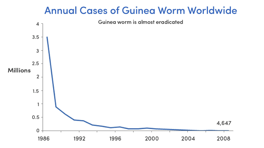
Guinea worm cases (Source: GiveWell, Carter Center)
6. Teen birth rates

Teen birth rates (Source: Vox, Centers for Disease Control)
7. Homicide Rates in Western Europe

Homicide rates in Europe (Source: Our World in Data, Max Roser & Manuel Eisner)
8. U.S. Violent Crime Rates, 1973 – 2010
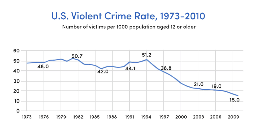
U.S. violent crime rates (Source: Gallup, Bureau of Justice Statistics)
9. Average Years of Education, 1820-2003

Average years of education (Source: Our World in Data, Max Roser)
10. Global Literacy Rates

Global literacy rates (Source: Our World in Data, Max Roser)
It goes without saying that our world is far from perfect. We could do well to make adjustments and learn from our errors. People on terror watch lists probably shouldn’t be able to purchase guns. Referendums are sometimes a bad idea. There are plenty of ways we can improve this little blue planet of ours. But we should also revel in our achievements and believe in a brighter future.
For the complete article, along with further context for each of the graphs listed above, check out the original post courtesy of Peter Diamandis, over here.
Top image is cover art for New Order’s Republic Album.

Leave a comment